Section 2 Price and Volatility
2.1 Price Moves
The figure below shows the percentage changes of the rolled price series of the universe of commodities we follow. Green and red bars represent increases and decreases in prices respectively. The vertical dashed line shows the mean absolute price (10.7%) change across all the commodities shown.
Figure 2.1: 2020 Q2 price changes expressed as percentages
On the positive side, we see that
- Rough Rice,
- Chinese soybeans, and
- Orange Juice
performed well above the other uptrends. From the imbalance between red and green bars, we can see that the majority of price moves have been negative. The large negative price moves in the energy sector have gained the majority of the media attention, however here we can see that over the second quarter Lean Hogs price declines have eclipsed those of the energy sector.
2.2 Volatility
Here we use the standard definition of volatility as the standard deviation of daily returns. We make use of the rolled price series for each of the commodities to determine returns. The gradient plots below highlight the changes in volatility between Q1 and Q2 of 2020. We separate the plots across different commodity sectors.
2.2.1 Energies
As we have noticed in the media there has been heightened activity in the energies space in the second quarter which culminated in negative prices on the front end of the curve. The plot below highlights the changes in volatility between the first and second quarters. We can see that crude oil and derivatives have experienced heightened volatilities during Q2.
Figure 2.2: Energies volatility gradient plot
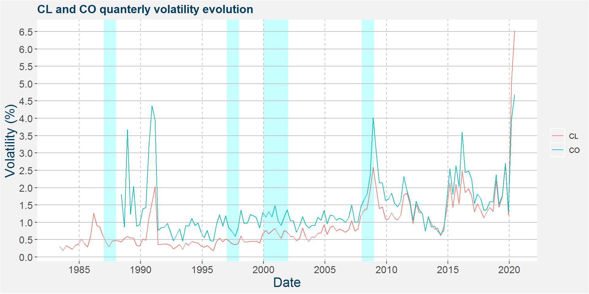
The plot below shows the evolution of the quarterly volatility of CL (WTI) and CO (Brent). The graph shows that CL and CO quarterly volatilities were at all-time highs during Q2 of 2020. The blue highlighted regions show past financial crisis events, from left to right:
- 1987 Black Monday
- 1997 Asian financial crisis
- 2000-2002 Dot com bubble
- 2008-2009 Global financial crisis

2.2.2 Meats
Below we show the change in volatility of the meats and livestock sectors. Here we can see that the steep decline in the lean hog price was coupled with increased volatility. It is interesting to see that the live and feeder cattle contracts showed decreasing volatilities.
Figure 2.3: Meats volatility gradient plot
2.2.3 Grains and Oilseeds
Below we split the grains and oilseed between the world and China. It is interesting to note that the second quarter did not show heightened volatility in the grains and oilseeds space. Moreover, some commodities even showed decreased volatility.
Figure 2.4: Grains and oilseeds without China volatility gradient plot
It is interesting to see that Chinese grains and oilseeds showed decreased volatility for all commodities shown except corn.
Figure 2.5: China Grains and oilseeds volatility gradient plot
2.2.4 Soft Commodities
Most soft commodities showed increases in volatility except for Arabica coffee. This big decrease in volatility was coupled with a large decrease in price over the same period.
Figure 2.6: Soft commodities volatility gradient plot
2.3 Sector Aggregates
Below we show the aggregated percentage price changes within each of the commodity sectors shown. Notice that the majority of the sectors shown had decreases in prices during the second quarter.
Figure 2.7: Q1 to Q2 sector aggregate price changes
The plot below aggregates the change in volatility withing each of the commodity sectors shown. Here we can see that the greatest changes in volatility were observed in the precious metals and Dairy and Juice sectors.
Figure 2.8: Q1 to Q2 sector aggregate volatility changes
The volatility results are interesting when combining with the sizing methodologies used by many CTAs where positions will be scaled inversely proportional to volatility. In this way the small uptrend in the precious metals, specifically Gold and Silver would have been coupled with a reduced volatility which would have increased notional position sizes within many CTA portfolios.
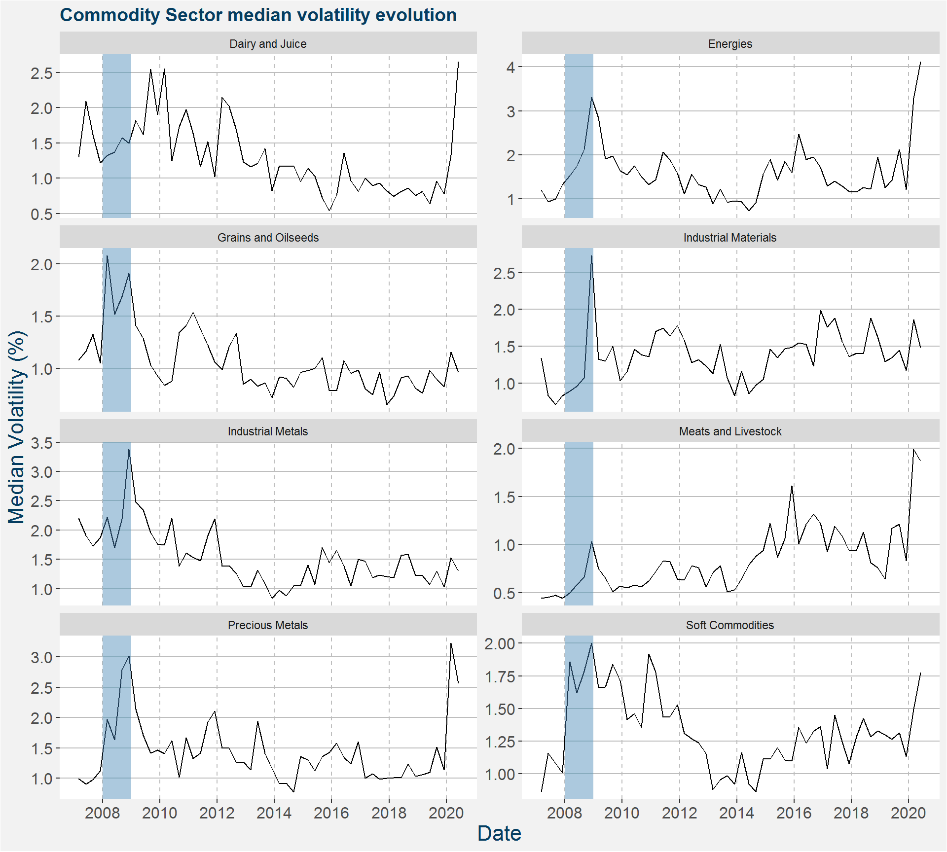
The plot below shows the evolution of the median volatility aggregated over the different commodity sectors shown. The Global Financial Crisis period has been highlighted in blue for easy comparison.

Figure 2.9: Commodity Sector median volatility evolution with GFC highlighted in blue